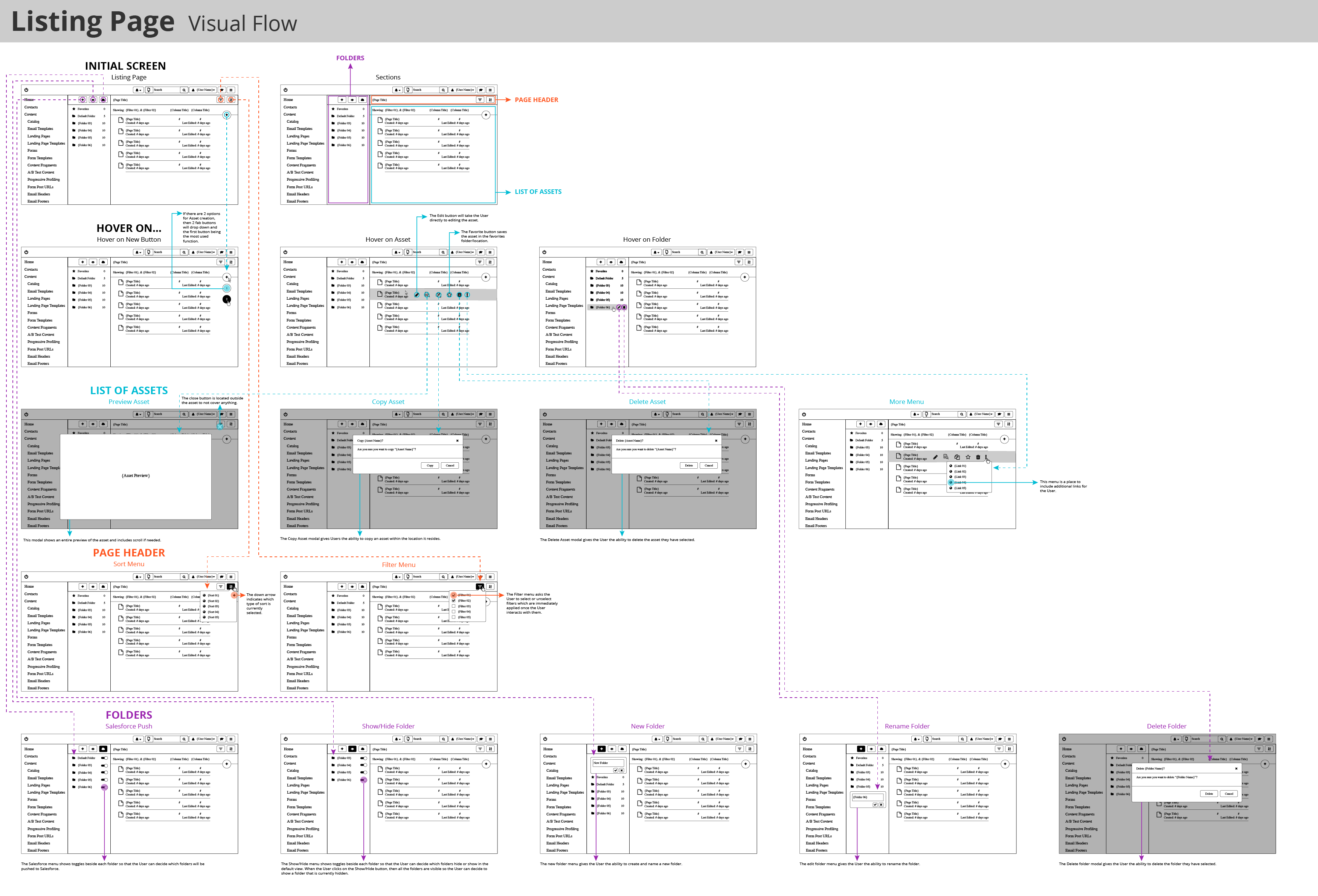
Responsive design
It was important to create a responsive design from the beginning. We needed to understand how the feature would change layouts based on the device. Our users are using the product the majority of the time, and need to access the product on a mobile device only a few times a year. So our priority was to first design for desktop, then design for the other breakpoints.
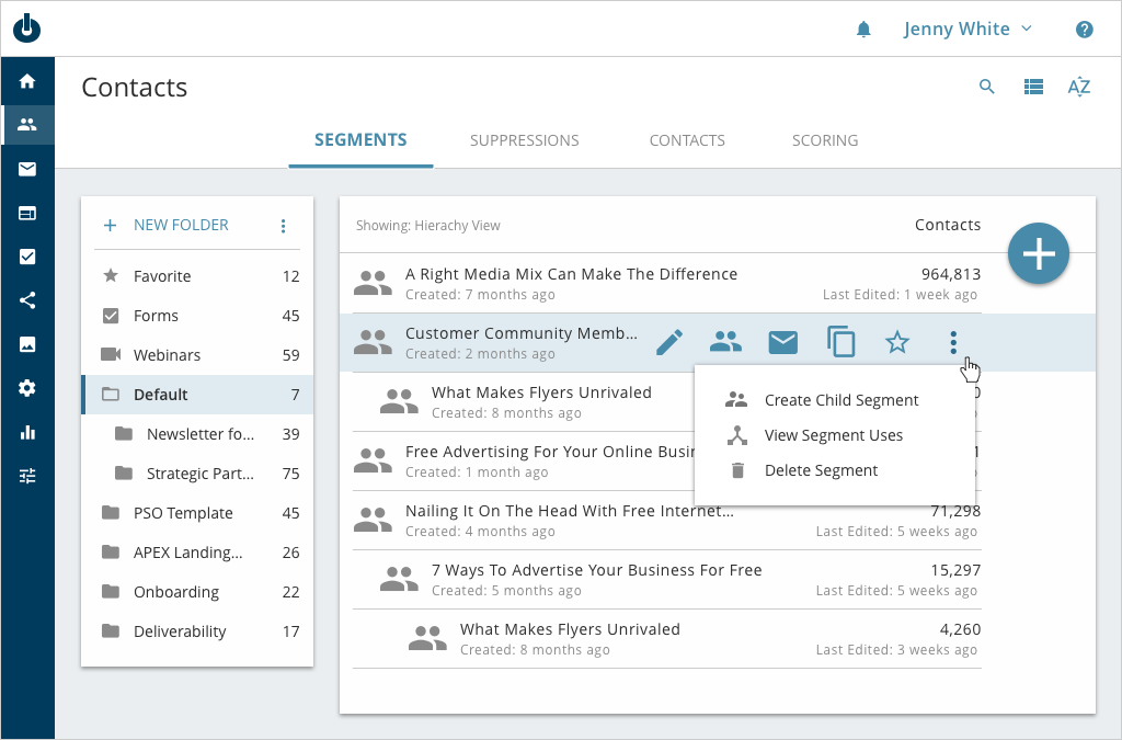
The benefit for designing for desktop is that we can utilize hover states to easily communicate interactions to the user. Designing for mobiles removes the ability to utilize hover states and interactions need to be very clear to the user.
Desktop design
We had a few goals for the project: consistent interaction, simple layout, clean design. At this point, the app’s style guide has been established (by myself). The style guide defines multiple states like, initial state, hover state, selected state. It also defines the primary action versus the secondary action. Because of the style guide had the visual definitions, it was easy to design the Contacts Listing Page. We took the time to simply the page while introducing a few new functions.
Mobile design
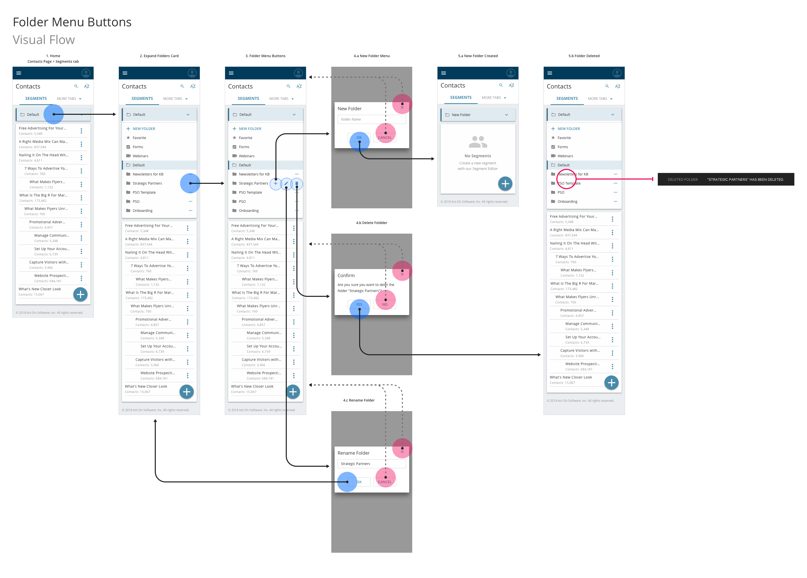
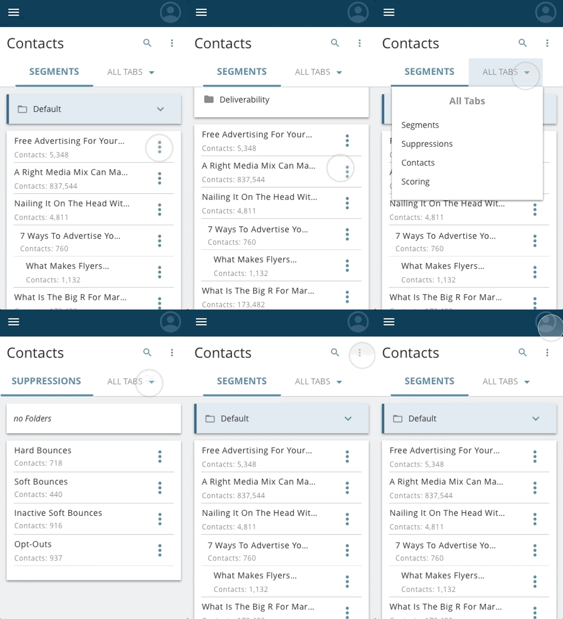
Here is a user flow that is on a mobile device. This flow shows all of the interactions for the folders on the content listing pages. The interaction shows how the menu displays the folders, and then how the user and find the three options for a folder: new sub-folder, rename folder, and delete folder. It is important to show the positive flow when the user does any of the possible interactions. It is equally important to show the negative flow if the user decides to cancel or abandon their actions.
Testing
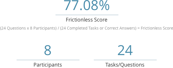
We then created a prototype to perform some usability testing. We wanted to know if the users could perform simple tasks in the Listing Page. We asked questions like, “Can you sort the Segments by most number of contacts to least” and “Can you change the view to List View.” We also wanted to know if users understood the labels in the menus l. After we performed our usability testing, we got a 77.08% frictionless score. We were very happy with the results. It showed what aspects of the designs worked well and which aspects of the design did not work well. This was greatly helpful to make some design improvements
Results
The Contact Listing Page is not a major feature in the product, but it’s part of the greater experience. This is the best example of “the small things matter”. After we made design improvements, we performed a second round of usability testing. We got a 86.12% Frictionless Score. We tested with power users and novice users and we were very happy with the result.

