Challenge
I was hired as the first and only designer for Act-On’s product team and have remained the sole designer. When I started, the product did not have an established product's design system; it was my job to develop, maintain, and manage the implementation of the design system. I worked closely with the product managers and front end developer to establish a design that was true to our brand principles: trustworthy, intelligent, and powerful.
We also wanted to build the design system that could easily scale up. As a result, we created a design system that clearly communicates the process of building web pages that stay true to our brand principles.
Approach
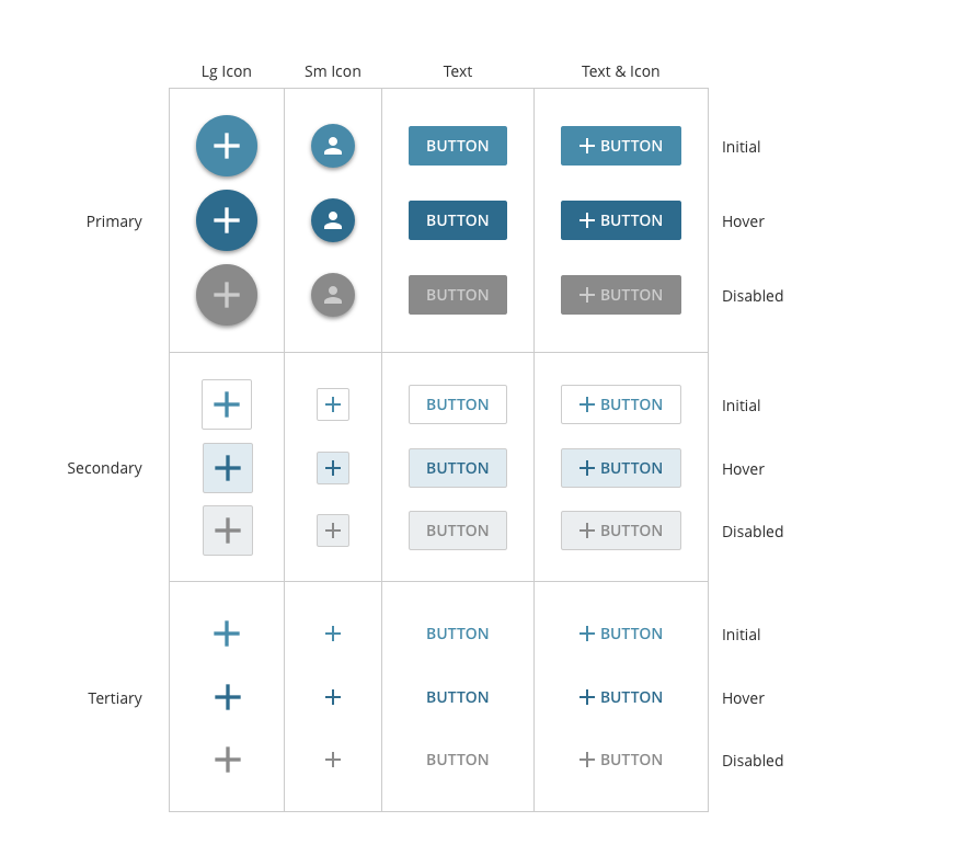
My initial approach for building the product’s design system involved three steps. First, define the elements that include color scheme, font, icons, and spacing. Second, build components with elements. Examples of components include: buttons, input field, tables, menus, etc. Third, create pages with components. Components are combined to build a page. This simplified process made it easy to scale and helped the engineers execute all of the designs.

Elements
Elements include buttons, menus, text boxes, check and radio boxes, tabs, tables, and tooltips. Once the visual language had been finalized, it directed how we defined the design of the elements. At that point, there was no debate over personal preferences because the visual language established consistency which helps create a better user experience.
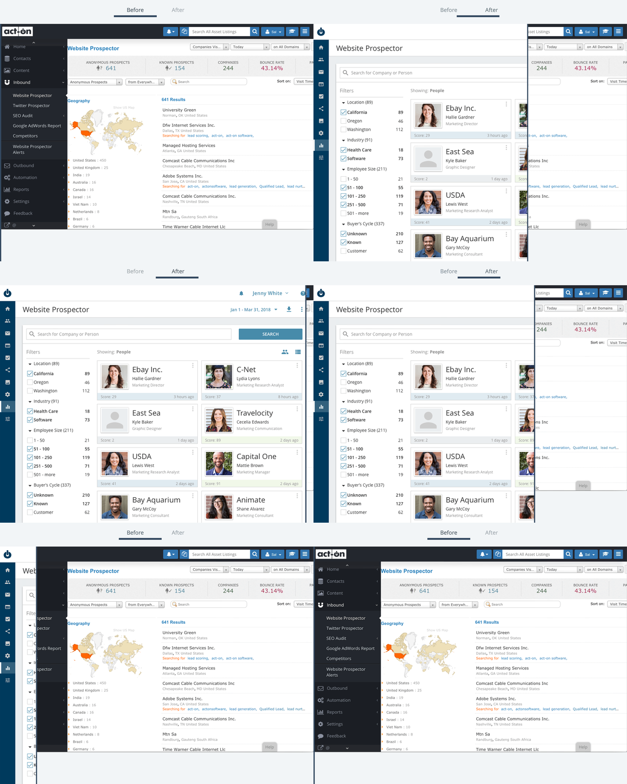
Before & After
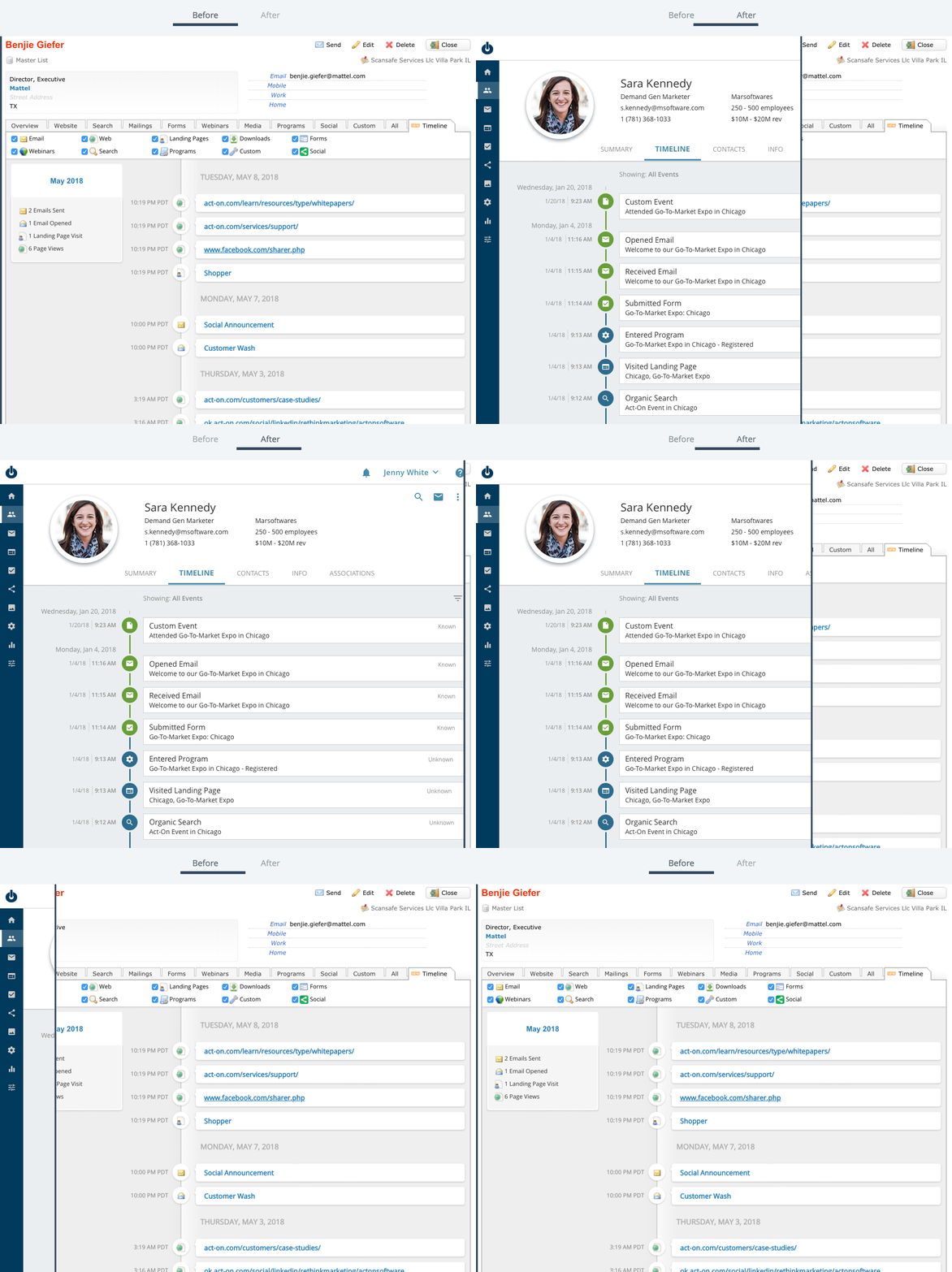
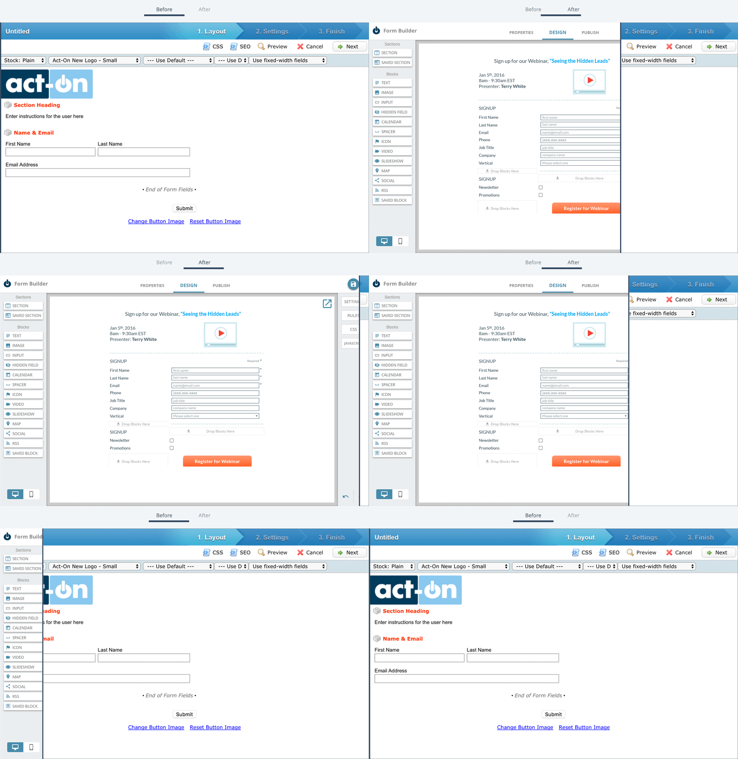
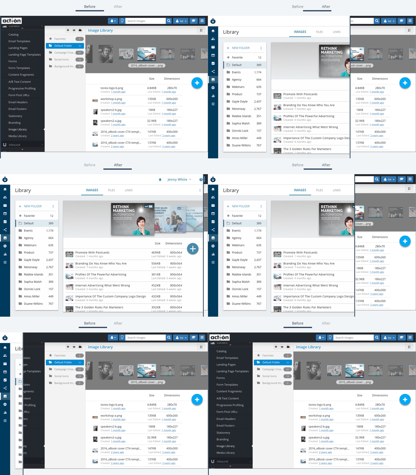
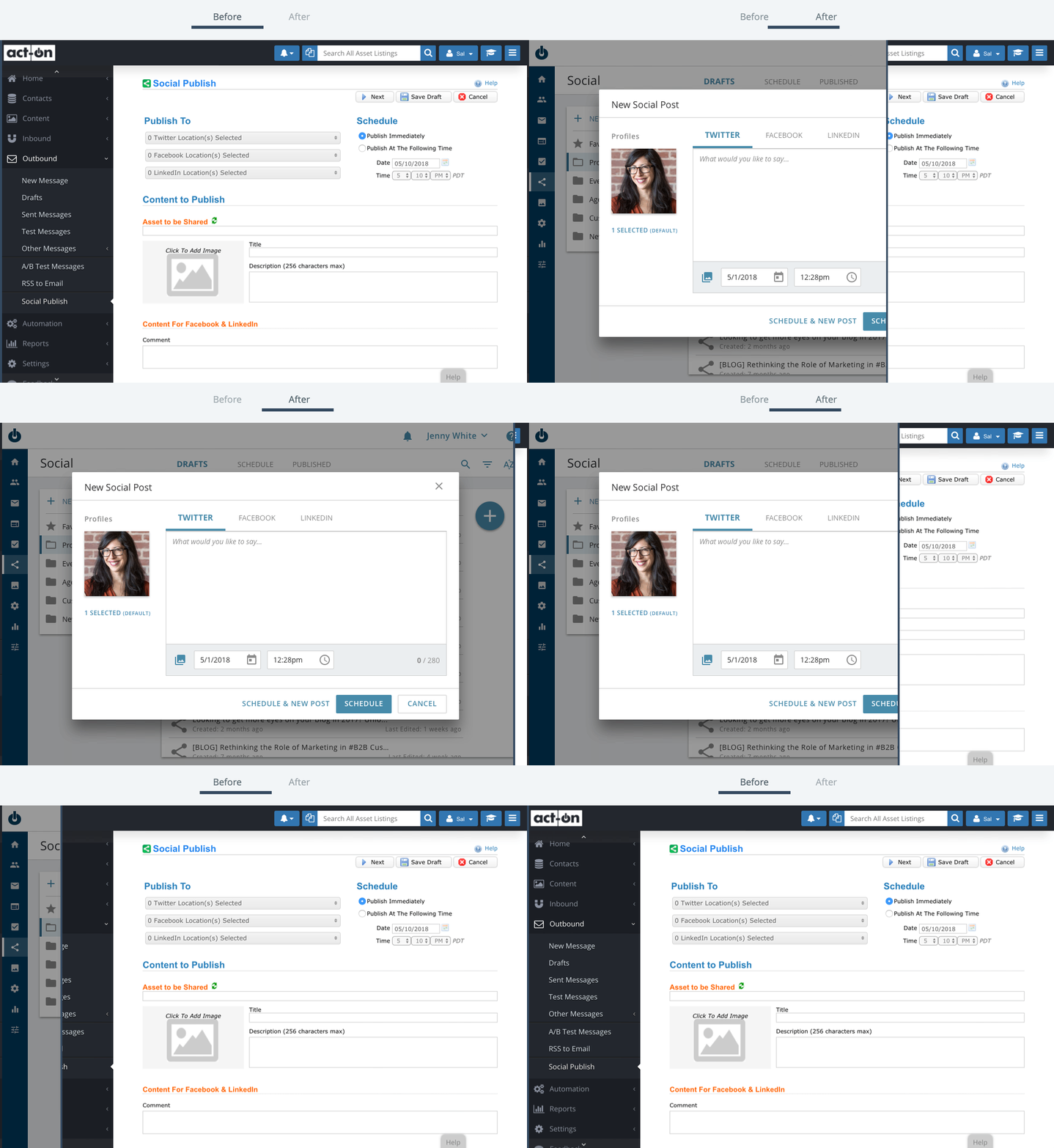
Here are a few pages before and after the new design system was implemented. Applying the design system established a beautiful design that aligned to our company brand and updated the interactions that were modern and intuitive. To add, ever element, component, and page, has a specific purpose. The elements aligned to the company’s brand, the components had specific interactions, and pages were aligned to user journey.
Before & After: Contact Profile
Before & After: Form Builder
Before & After: Image Library
Before & After: Social Post
Documentation
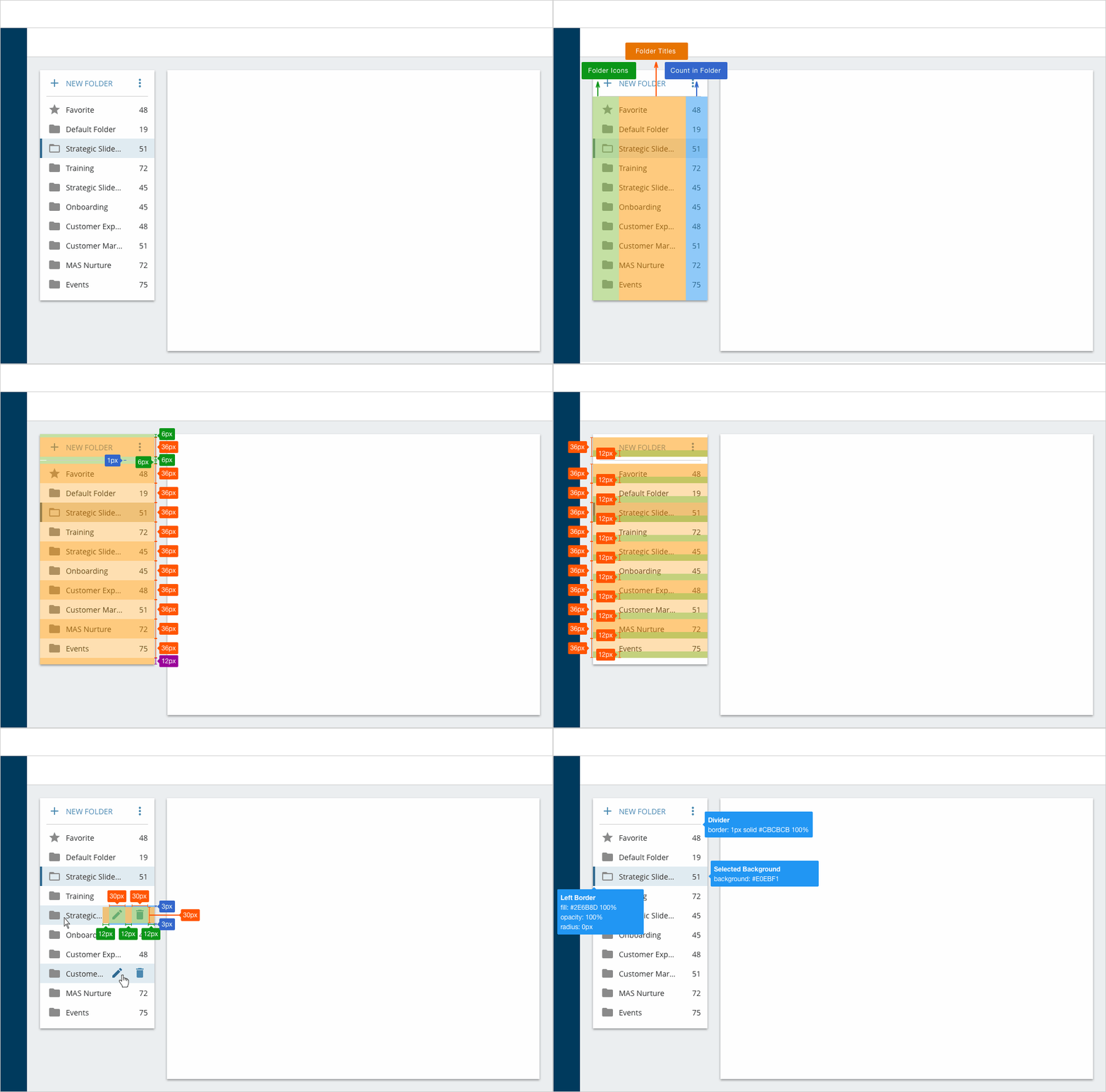
Elements composed together in a certain way create a component. Then a component can be placed on a web page. For example, Folders is a component that has many types of elements to it, such as buttons and icons. The Folders component is necessary for the Listing Page, yet it is available to be used on new web pages. Each component consists of labels, spacing, and alignment specs for clarity when the engineer develops it.
Result
The biggest challenge in creating the product;s design system was creating a solid visual language. The visual language needed to be simple and communicate the idea clearly. Essentially, the visual language is the foundation of the design system. Once the foundation was solid, all the work moving forward was easy and took less time to execute.
In the end, we simplified the app from 300 pages into 5 basic types of pages. It was beneficial to the team to establish a long term vision for the product that was clearly communicated in the product's design system.