Challenge
The Classic Form Builder was outdated, using old technology and old interface design. At first glance, the classic interface was overwhelming. It included multiple options but no clear primary action. To transform this feature into an experience both easy to understand and easy to use, we needed to make a lot of changes.
First, we researched how customers were using our Classic Form Builder. It was essential that we keep important technology and features while introducing improvements.
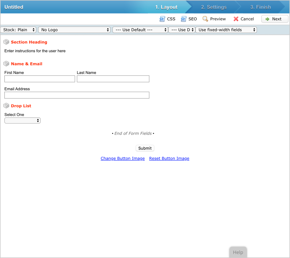
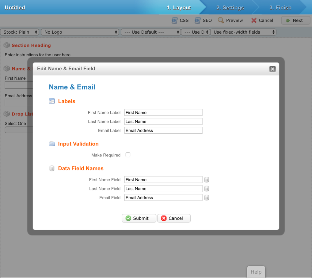
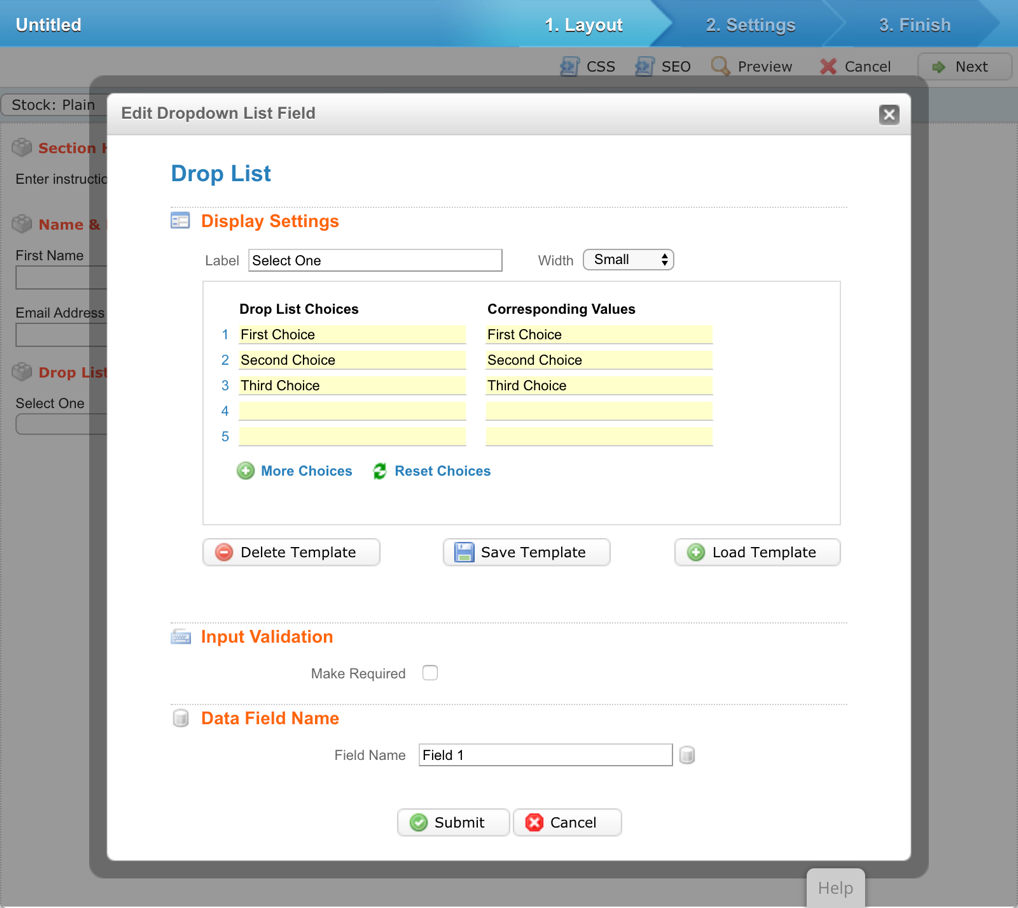
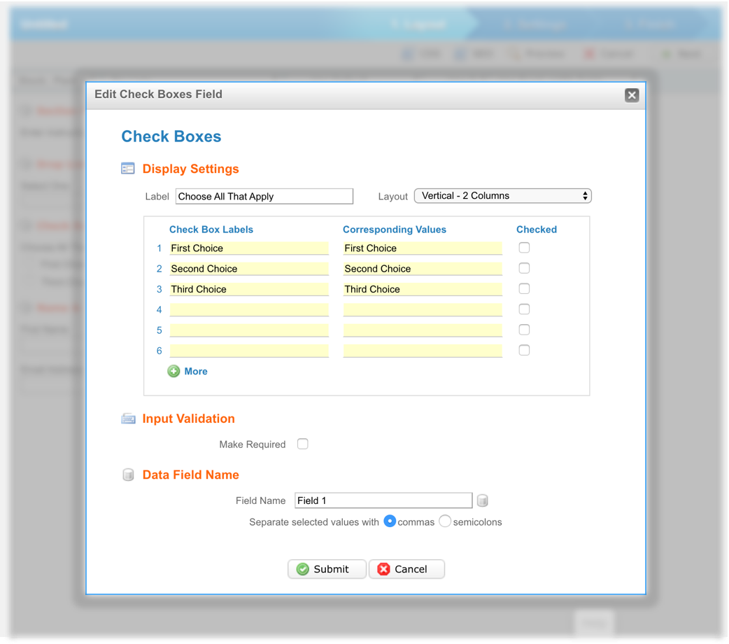
The Classic Form Builder prompted the User with a modal so the User could edit the form input fields. In the New Form Builder, we transitioned these modals to a slideout interaction, which we had established as a common design trend when redesigning our Email and Landing Page Builders.
User Persona
One of the marketer’s biggest challenges is understanding why a campaign was successful, and how he or she can duplicate that process. If the marketer can clearly understand why his or her campaign was successful, then we at Act-On can help the marketer become more efficient at their job. If we can help make the marketer more efficient at their job, then we are doing our job successfully.

5 Basic Interactions
First we designed the flow within the Form Builder. The Form Builder has 5 basic interactions: Navigation, Edit, Selection, Confirmation, and Preview. Each interaction has a specific flow for consistency.

Content Blocks
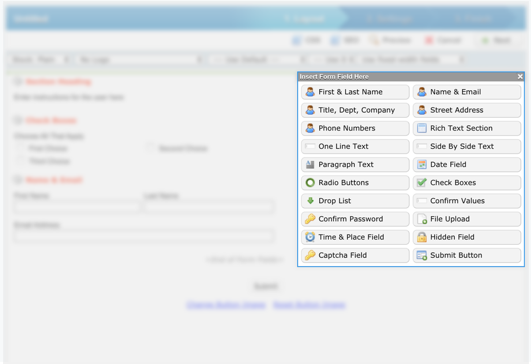
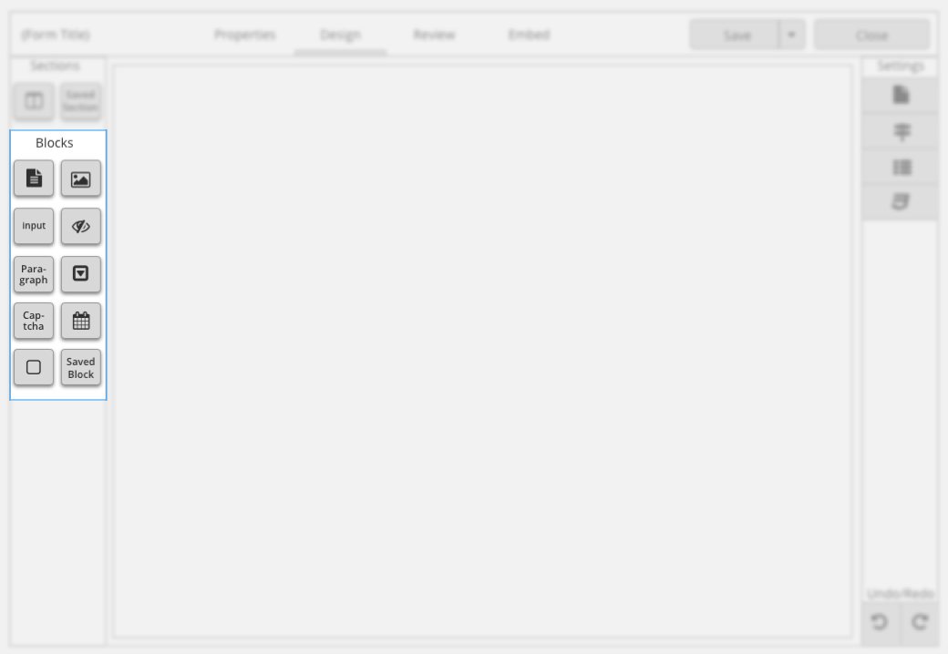
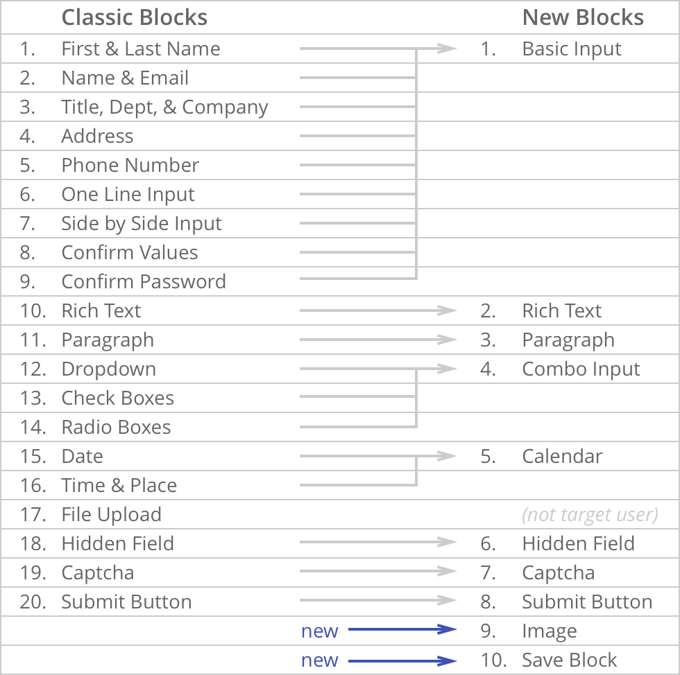
Content Blocks is the core function to help the user build and edit their form. The old Form Builder had too many blocks; they needed to be simplified to a few blocks. Our goal was to reduce the number of blocks so the user was not overwhelmed. Paring down the options made it easier to select the appropriate block for the task.
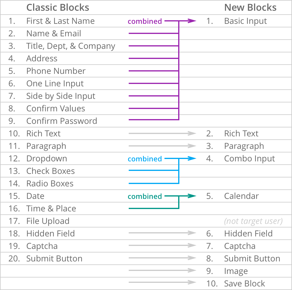
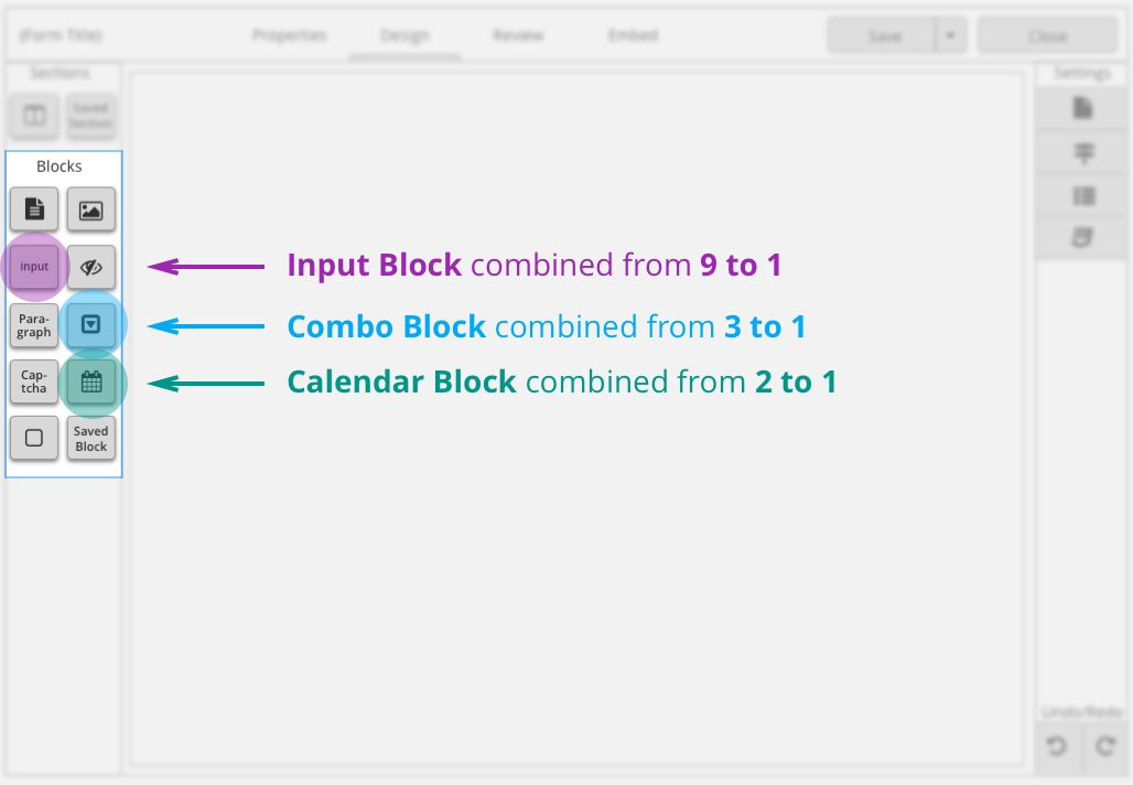
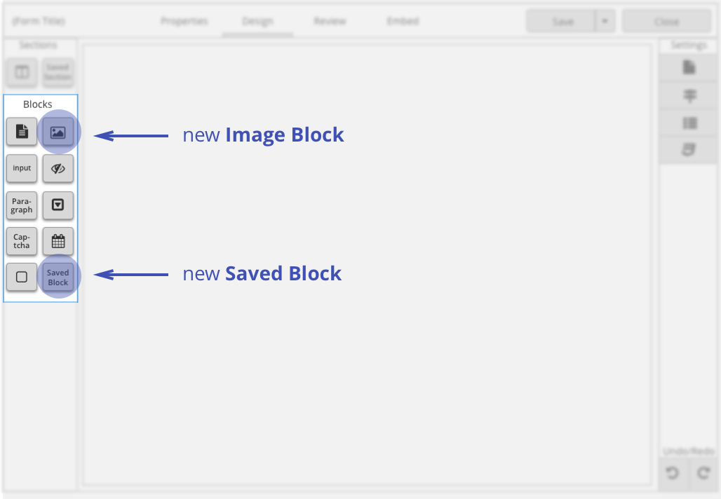
The old Form Builder had 20 Content Blocks. The new Form Builder cut the original 20 down to 8 blocks without losing any functionality, plus added 2 blocks with new functionality.
Combo Block
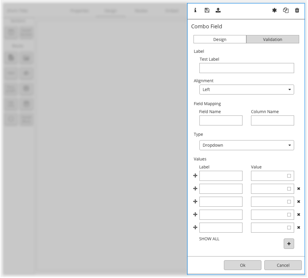
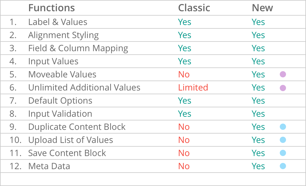
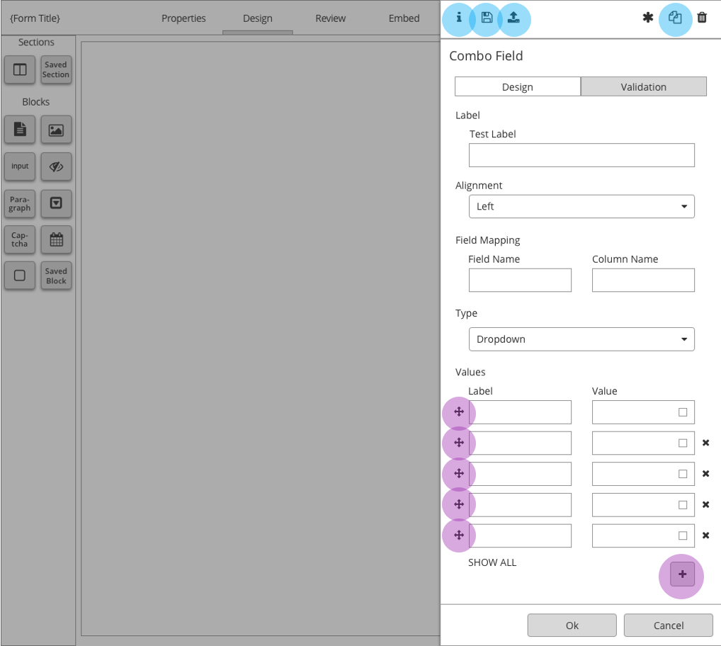
The new Combo Field Block combined the original Drop Down Menu, Check Boxes, and Radio Buttons Blocks. Because those three multiple choice blocks have many similarities it was beneficial to simplify the 3 blocks into 1 combo block. The combo block preserves all the functionality from the 3 multiple option blocks, streamlines the format, and introduces new functionality including uploading values and showing metadata.
The first design step was to transition the layout from a modal to a slideout. The slideout shows the basic functions with additional functionality accessible by tabs and header buttons.
Before & After
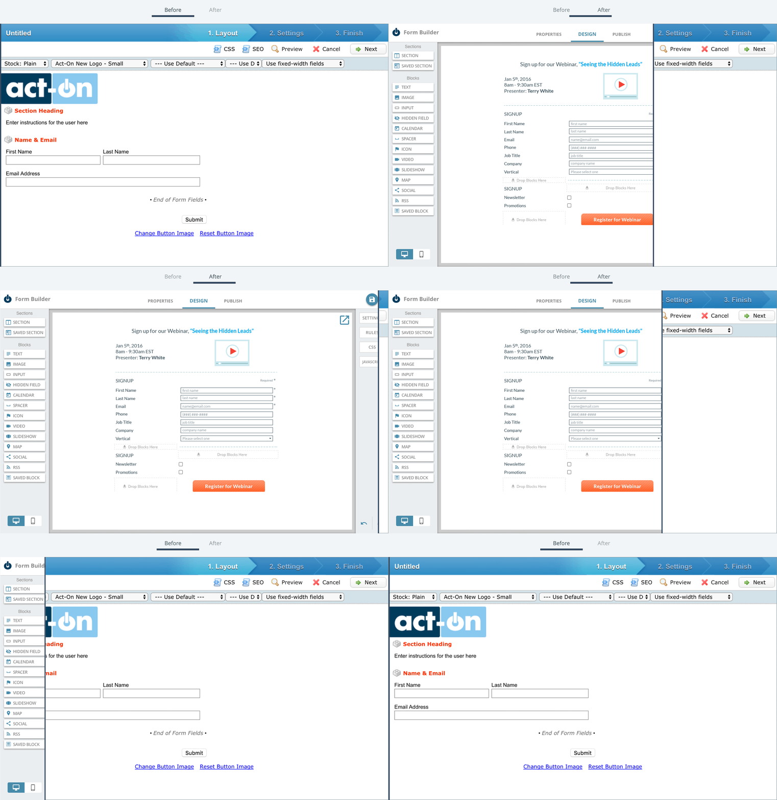
Here is a screen that shows the Form Builder before the design system was created and after the design systems was created. These screens show a drastic change to the interface and successfully achieves our goals: brand, simplicity, and scalable.
Results
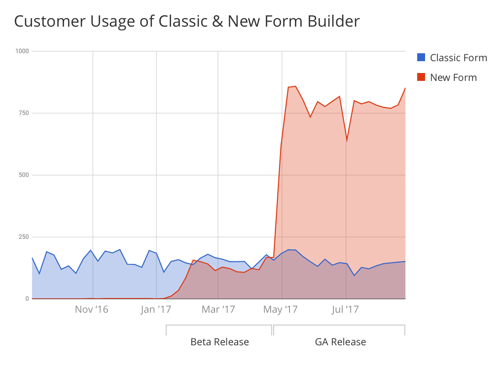
After releasing our New Form Builder, using the new style guide, to all our customers, an extremely high number of customers were using the feature. Customer adoption tripled from the average use of the Classic Form Builder. We credit this success to our process: stating our goal, performing research, outlining a clear direction, and continually gathering feedback internally and externally.
The key to our design process is clearly establishing which problems we are trying to solve. We may iterate on multiple solutions, but we know we are moving in the right direction when each iteration provides a better solution to the problem than the one before.
