Information-architecture
Re-evaluating the product navigation
Information-architecture
Re-evaluating the product navigation

Challenge
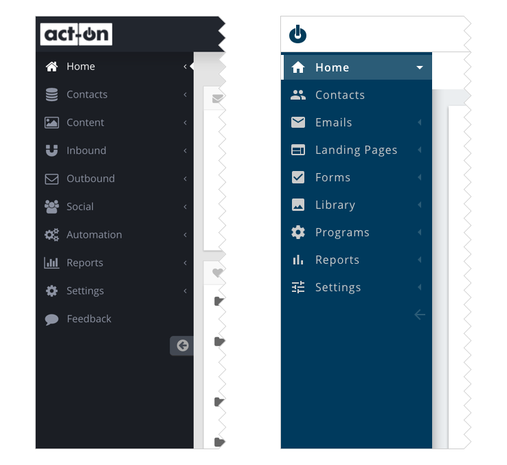
Our challenge was to reorganize Act-On app’s navigation. The app’s navigation had problems including difficulty finding tools and a lack of clarity in identifying the product’s main tools. We wanted to find solutions to these problems and turn them into the best parts of the app’s navigation.
Our goal for the app navigation was to make features easy to find and to clearly identify Act-On’s core tools. Before we could create a successful solution, we needed to establish our approach to the project.
In addition, the app’s navigation was organized based on the marketing strategies of outbound and inbound marketing. We needed to find out whether customers found this was a helpful organizational structure or if there was a better method to organize the app’s navigation.
User Journey Map
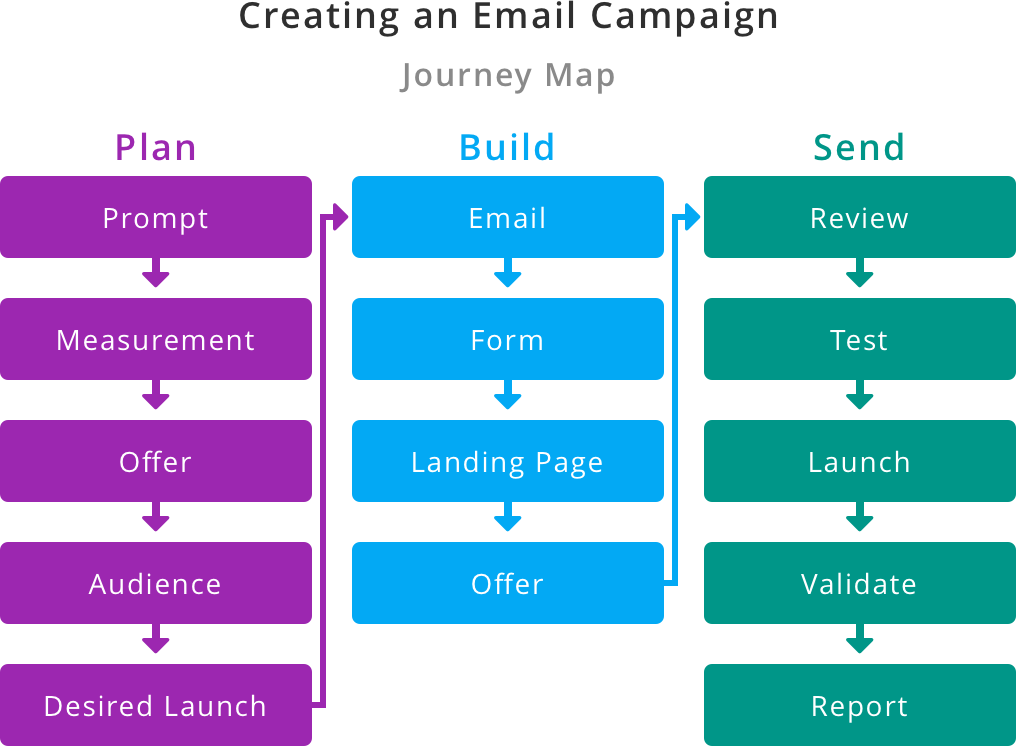
We decided to develop a journey map by speaking to customers. We were able to speak to 10 customers to learn more about their work activity. We also spoke to our customer support department to learn from their experience. Our customer support department has helped many customers onboard onto the app and helped customers execute marketing campaigns from start to finish. More importantly, our customer support members had insights into our customers’ specific needs.
Workshop
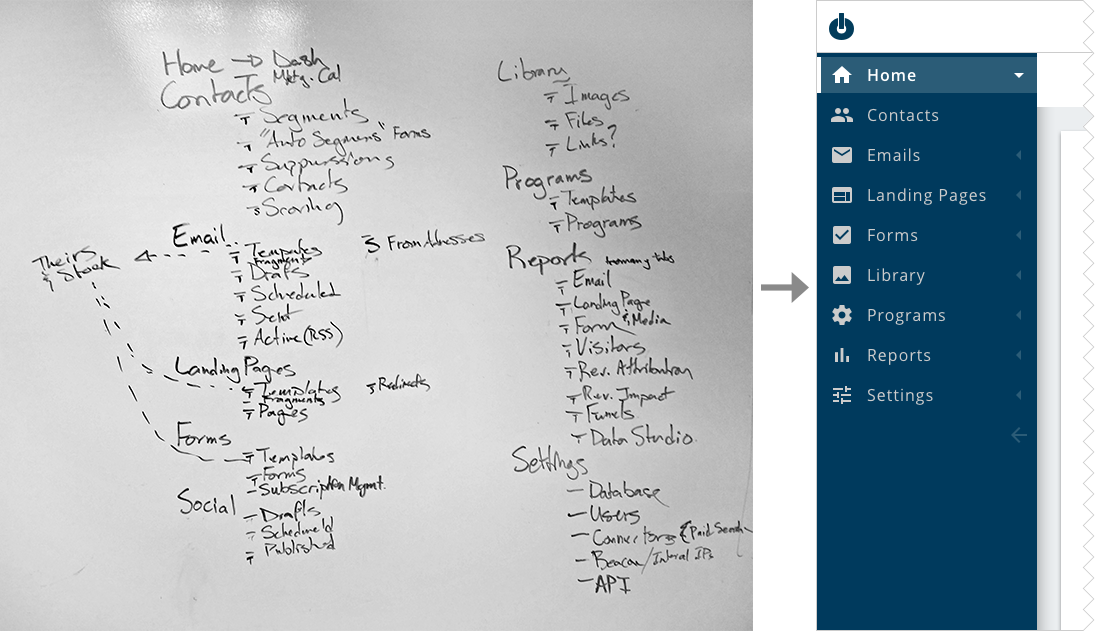
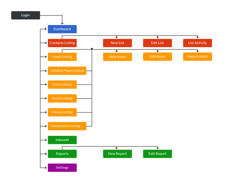
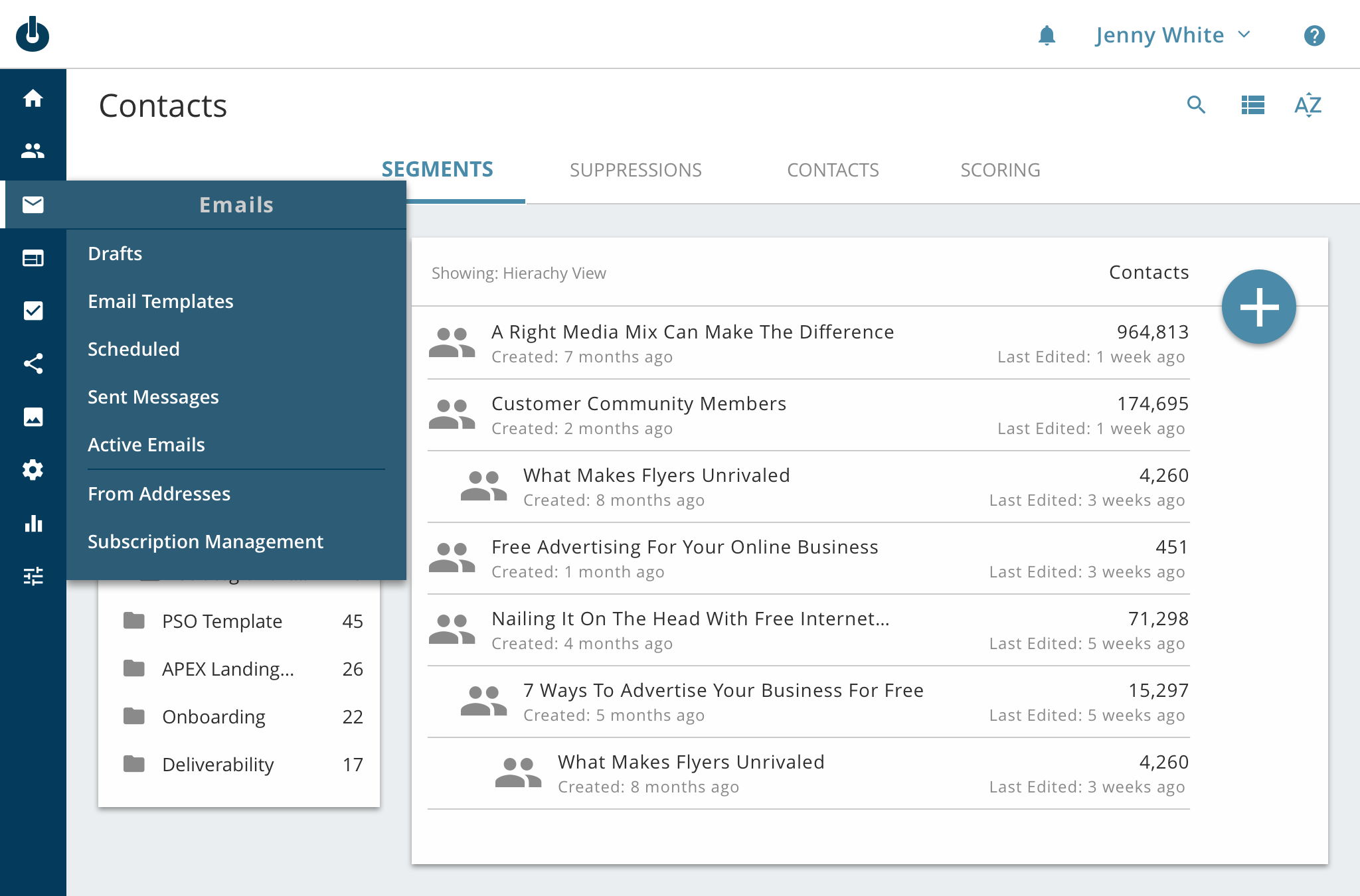
As a team, we did a whiteboard session to reorganize the links in the navigation. Because of the journey map, we focused on the idea that the marketer is intent on creating a campaign to push prospects through a marketing funnel. Each campaign requires a target audience, an offer, design, and copy. Act-On’s product helps the marketer create a segment of contacts and assets for the campaign: email, landing page, form, social, and an image library. Next, the marketer puts together marketing assets and automates the campaign. Once the campaign has launched, the marketer will come back and generate reports on the campaign to gauge its success.

Testing
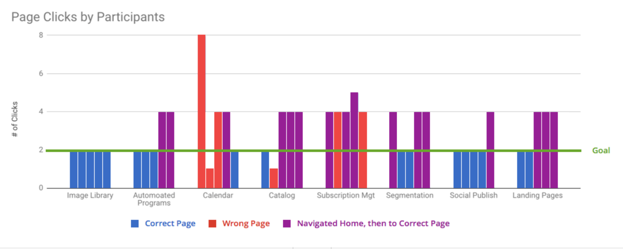
We performed usability testing with 5 customers, three powers users and two novice users. We wanted to get feedback from customers who were experienced with the current navigation and customers who had no bias to the app’s navigation. We asked each user to try to find some pages with the new app’s navigation. It was great to see that most customers were able to find 8 of the 10 pages. It was even better to hear the customers’ feedback comparing the old navigation to the new navigation. One customer in particular said, “As a marketer, I'm never thinking I need to do outbound activity. I needed to go to landing pages or email.”
Successful solution
We have reorganized the app’s navigation to align with the user’s workflow. The result is the user has an easier time finding specific tools. Customers were very positive about the change and mentioned they prefer the new organization over the app’s old navigation. Most customers stated that they open the app with the idea that they need to do a specific task, and the reorganized navigation is based on that logic, which helps the user complete their task.