Sal Criscione

About me
I earned a degree in Digital Illustration, taught myself web design, and found my career in UI/UX design. As I learned more about Design Thinking, my career evolved to encompass UX research. I am currently a full-time UX Researcher and am passionate about the work I do everyday. My career path is slightly unorthodox, yet I am proud of it. My background helps me bring a different perspective to the teams I work with.

Goals
My goal is to help teams learn about the customer problem and iterate to find the best design solution. I enjoy working in different industries along with finding new ways to innovate.
Projects

Here are a few projects I have worked on.

Recent UX Research Projects

I cannot present the work I have done for the last three years on my public website. However, I am happy to share my UX research work experience. I am currently a UX researcher at JP Morgan Chase. I have conducted both qualitative studies and quantitative studies. My research studies span from understanding the user's wants & needs, to concept testing, and usability testing. Some of my skills includes, moderating interviews, unmoderated studies, survey design, and heuristic evaluations.

Please reach out to me to learn more about my recent UX research experience. Visit my resume page.

Form Builder

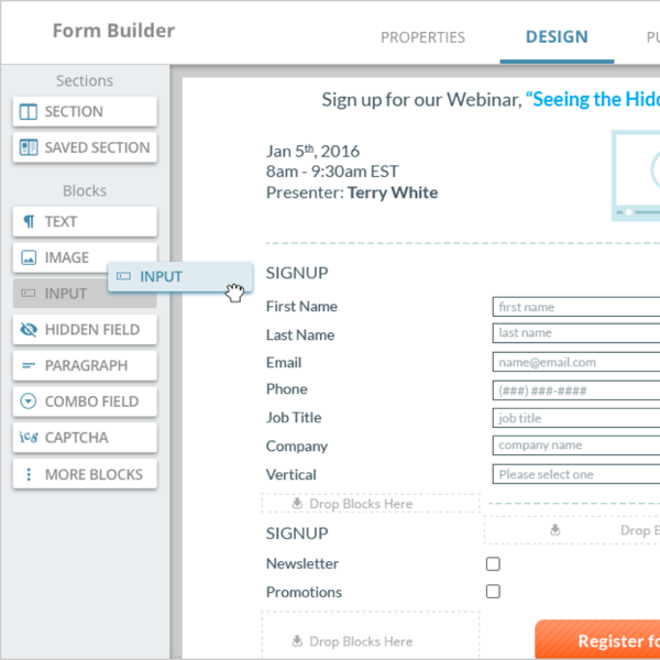
The Form Builder was a tool for marketers to help them build a form for their marketing web pages. The feature was outdated and we needed to be updated with modern technology. As a team, we saw this opportunity to make the user experience more intuitive and delightful.

The Form Builder was 1 of 4 building tools that Act-On Software Inc. built. We needed to create a tool that aligned to the standard interactions that we defined with the other builder tools that we created. Forms become complex when you learn about all of the capabilities but our job is to make it simple for the user.

Information Architecture

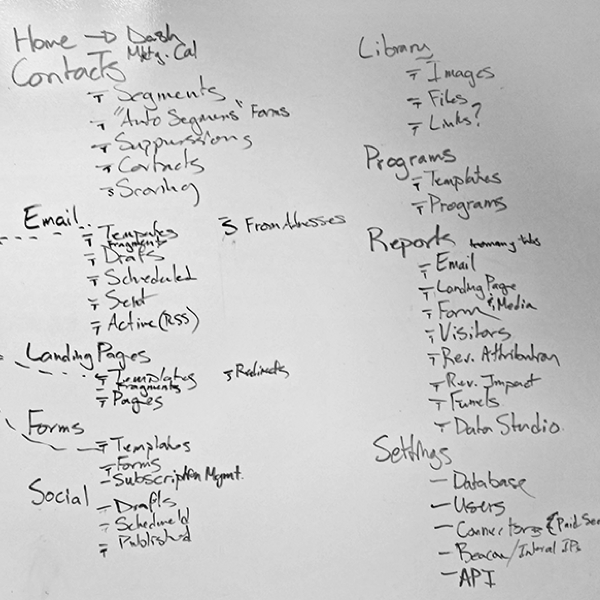
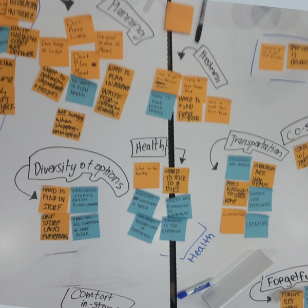
Our challenge was to re-evaluate the information architecture for the product’s main navigation. As a team, we decided to develop a journey map that connected to the user persona. Our goal was to develop the navigation to be intuitive for users so they could easily find the tools they are looking for. In addition, our other goal was to make new features discoverable by our users.

Our end solution was a product navigation that aligned to the user’s work flow and became easy for users to find the tools they were looking for.

Content Listing

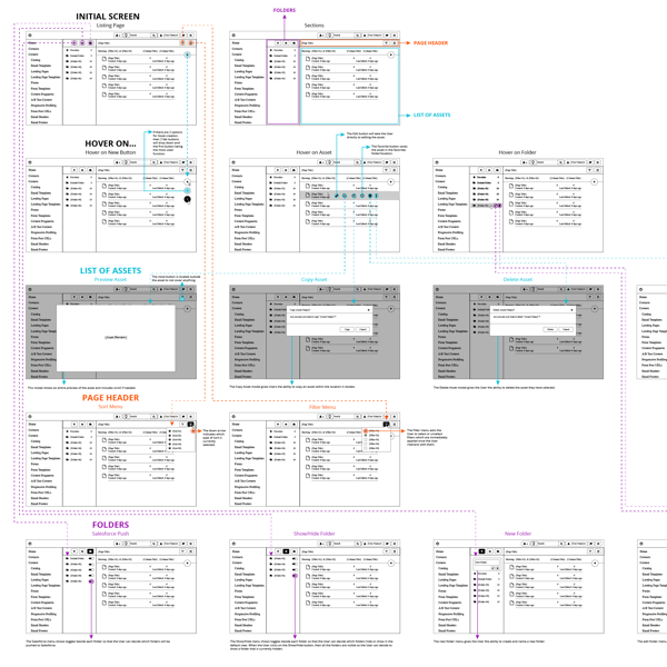
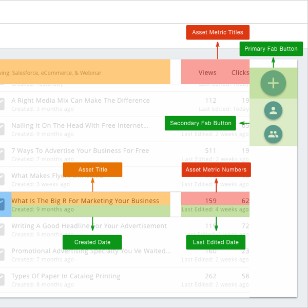
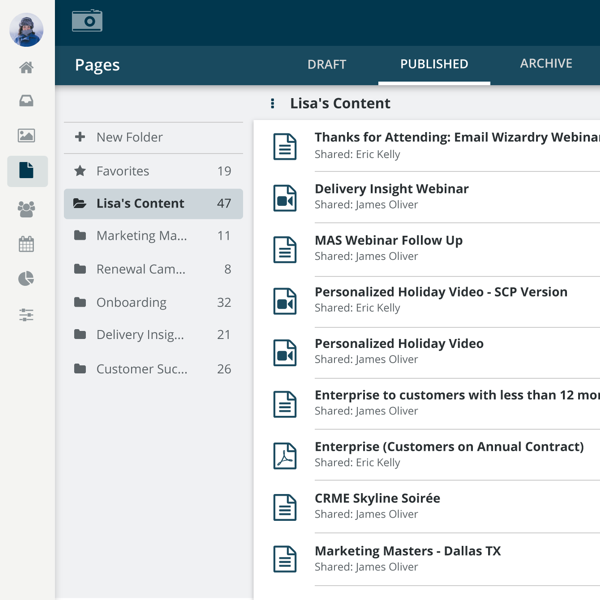
The Contact Listing Page displays a list of content for the user. The content included: emails, landing pages, forms, images, and segments. We outlined the user flow to see all of the different interactions that the feature has to offer. Next we performed user testing to learn which interactions were easy to use and which interactions were difficult for the user. Then we improved the designs.

We created desktop designs and mobile designs, but desktop was our priority. Our user is a marketer, and he or she is at work creating marketing assets for their next marketing campaign. They needed to be efficient at their job and our goal was to help them be efficient.

Design Systems

The design process we created for developing the design systems was, “Elements > Components > Pages”. This process simplified the development of the Design System. Our goal for the Design System was to make visuals align with our brand, make the system scalable, and to design for simple.

Elements defined the color palette, font, icons, and spacing. The components combined elements to have an interaction which included: buttons, input field, tables, menus, etc. Pages combined components onto a web page. This process, “Elements > Components > Pages”, was easily communicated across departments and teams.

Interactive Chart Selector

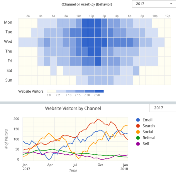
This is the project that helped me understand data visualization more than any other project. I designed an Interactive Chart Selector tool to help the multiple teams to consistently select the same types of visual charts based on the data type they are using. The tool uses variables and data points to determine the best possible visual chart to be used for you. The tool also highlights good charts and bad charts with examples.

The team found the interactive chart selector tool to be very helpful to understand which charts they should use and why. The tool helped team member more effectively do their job along with learning about data visualization.

Media Listing

Here is a project that I coded using HTML, CSS, and Javascript to make a clickable prototype. I used the bootstrap frame to start the project. I wanted to practice the design process with this project. I started with a design that I created in Sketch, and then I coded the concept in JS Fiddle. It was important to create all of the settle animated transitions so that I could hand it off to a developer.

After completing this project, I learn about all of the different design states for developers to properly do the front-end code. It was a great learning experience to get into the shoes of a front-end developer

Personal Projects

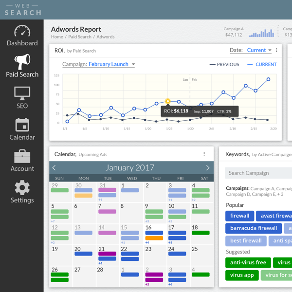
Here are a couple freelance projects I have worked on. Some of these projects have been a dashboard design or a report design. These projects showcase my visual design skills along with creating a user experience that is for the the customer.

These projects helped me learn about the different types of visual design within different tool and within micro interactions. Today I still work on freelance projects to continue expanding my skill set.